Introduction
In the world of digital marketing and user experience, countless hours are spent optimizing landing pages, refining form fields, and A/B testing calls-to-action.
But for many businesses, the user's journey screeches to a halt right after the "submit" button.
They're met with a generic, often bland, "Thank you for submitting" message, a digital equivalent of an awkward silence after a successful handshake.
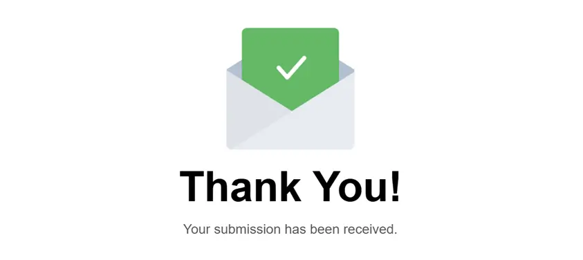
Thank-you page example
This isn't just a minor oversight; it's a significant missed opportunity.
The moment a user successfully completes your form is a golden moment of engagement, trust, and potential. They've just taken a desired action, signaling interest or intent.
What you do with that moment can dramatically impact their perception of your brand, their likelihood of taking a next step, and ultimately, your conversion goals.
The Forgotten Real-Estate of Online Forms
Online forms have come a long way — they're more interactive, intelligent, and visually pleasing than ever. But there's one part of the experience that hasn't kept up: the thank-you page.
For many businesses, it's an afterthought. Users click submit, get a bland confirmation message, and the journey ends there. That's a problem.
A well-crafted thank-you page isn't just polite. It's strategic real estate.
Think of your thank-you page not as an endpoint, but as a crucial transition point.
According to Unbounce's insightful guide on thank-you pages, treating this moment as an afterthought means leaving potential conversions, brand building opportunities, and valuable insights on the table.
It's time to elevate the humble thank-you page from a forgotten formality to a strategic powerhouse.
The Post-Submission Moment
When someone clicks "submit" on your form, they've just completed a mini-conversion.
Whether it's signing up for a newsletter, downloading an ebook, requesting a demo, or making a purchase, they've invested time and trust in you.
This is a high-intent moment, and how you acknowledge it sets the tone for the rest of their interaction with your brand.
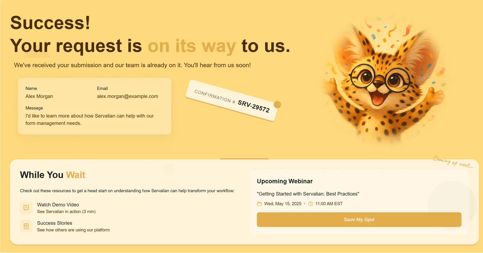
Thank-you page example
Simply displaying a default "thank you" message misses the chance to:
Confirm Success and Build Trust
The first and most crucial job of a thank-you page is to reassure the user that their submission was received successfully.
A clear, unambiguous confirmation message reduces anxiety and builds immediate trust.
As Apexure, a leading high-converting landing page agency emphasizes, a positive and clear post-submission experience is fundamental to building user confidence and encouraging future interactions.
Reinforce Brand Identity
Your form is a touchpoint, but so is the page that follows.
A branded thank-you page, consistent with your website's look, feel, and voice, reinforces your professionalism and identity.
It's another opportunity to make a positive impression.
Manage Expectations
When will they hear back? What should they do next?
A good thank-you page answers these questions proactively, reducing support requests and user frustration.
Setting clear expectations is a cornerstone of good customer experience.
Keep the Momentum Going
Users are engaged at this moment. Why let that energy dissipate?
The thank-you page is the perfect place to guide them towards the next logical step in their journey with your brand.
Strategic Goals Your Thank-You Page Can Achieve
VWO, a leading A/B testing platform, highlights that optimizing thank-you pages can significantly contribute to overall conversion funnels, turning satisfied form submitters into active users, engaged readers, or repeat customers.
It's not just about the immediate form conversion, but the long-term customer relationship.
Beyond simply saying thanks, what tangible business objectives can this page support? Quite a few, actually:
1. Driving Engagement
Encourage users to explore more of your content.
Link to your blog, popular articles, helpful resources, or case studies relevant to the form they just completed.
This keeps them on your site longer and exposes them to more value.
2. Increasing Social Follows and Shares
Capitalize on the moment of positive interaction.
Prominently display links to your social media profiles and encourage them to connect or share the content/offer they just received.
This expands your reach organically.
3. Promoting Related Offers or Products
Did they download an ebook on email marketing? Link to your email marketing software trial or a related course.
Did they request a quote for service A? Suggest they also check out service B.
Leadpages, a platform focused on landing page optimization, frequently discusses how strategically placed upsells, downsells, or cross-promotions on thank-you pages can directly impact revenue.
4. Gathering Feedback
A short survey or link to a feedback form on the thank-you page can capture valuable insights while the experience is fresh in their minds.
5. Facilitating Navigating
Provide clear links back to key areas of your site – your homepage, contact page, or product/service pages.
6. Delivering Instant Gratification (for Lead Magnets)
For lead magnets like ebooks or templates, the thank-you page is often the ideal place to provide the download link directly, rather than making the user wait for an email.
This immediate delivery improves user satisfaction and bypasses potential email delivery issues.
Even small changes like adding a social share button or a link to related content can noticeably increase engagement metrics on this often-overlooked page.
Anatomy of an Effective Thank-You Page
Here are key elements, from foundational necessities to strategic additions, to include in your thank-you page:
1. Clear Confirmation Message
- What to Include: A prominent headline like "Thank You!" or "Success!"
- Add Depth: A slightly more detailed message confirming what they submitted (e.g., "Your contact request has been received," or "Your download is ready!").
- Personalization: If you collected their name, use it! "Thanks, [Name]!" makes the experience more personal.
- Visual Cue: A checkmark icon or subtle animation reinforces the success.
2. Confirmation of Next Steps & Timeline
- What to Include: Clearly state what happens now.
- Add Depth: "We've received your message and will get back to you within [specific timeframe, e.g., 1 business day]." or "Check your inbox (and spam folder) for the download link."
- Link to Resources: If they need to do something (like check email), tell them explicitly.
3. Strong Branding
- What to Include: Your logo, consistent brand colors, and fonts.
- Add Depth: Maintain your brand's tone of voice in the copy. Is your brand formal or playful? Reflect that here.
4. Relevant Call-to-Action (CTA)
This is where you guide the user's next move.
- What to Include: A clear button or link prompting the desired action.
- Add Depth & Examples:
- "Download Your Free Guide Now" (for lead magnets)
- "Schedule a Demo" (if they requested info)
- "Read Our Latest Blog Posts"
- "Visit Our Product Page"
- "Explore Case Studies"
- "Refer a Friend and Get 10% Off" (if applicable)
- "Join Our Community Forum"
5. Social Proof (Optional but Powerful)
- What to Include: Links to follow you on social media.
- Add Depth: Consider embedding a recent social media post or displaying your follower count (if impressive) to build credibility.
6. Valuable Content or Resources
- What to Include: Links to related blog posts, FAQs, support documentation, or useful tools.
- Add Depth: Curate content specifically relevant to the form they just submitted. If they downloaded an beginner's guide, link to an intermediate one or a related webinar.
7. Contact Information or Support Link
- What to Include: A clear, alternative way for users to reach out and ask questions if the next steps aren't clear or something goes wrong.
- Add Depth: Link directly to your contact page, support portal, or even embed a chatbot widget.
8. Tracking and Analytics
- What to Include: Ensure your analytics tools (like Google Analytics, Posthog, etc.) are tracking visits to this page.
- Add Depth: Set up this page as a conversion goal in your analytics to accurately measure form submissions. You can also use tools like Google Tag Manager to trigger specific events (like a Facebook Pixel conversion event) when this page loads.
Inspiration Gallery: Thank-You Page Examples That Get It Right
Looking for ideas? The best thank-you pages are tailored to the specific form and user intent.
The "Instant Access" Page (Lead Magnets)
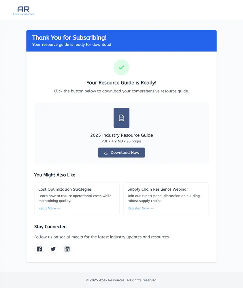
Example of a thank you page for lead magnet forms.
- Focus: Immediate delivery of the promised content.
- Elements: Clear download button (or the content embedded directly), brief confirmation, suggestion to follow on social media or read related blog posts.
- Why it works: Fulfills the user's expectation quickly, builds trust, and offers natural next steps.
The "What to Expect Next" Page (Contact/Demo Requests)
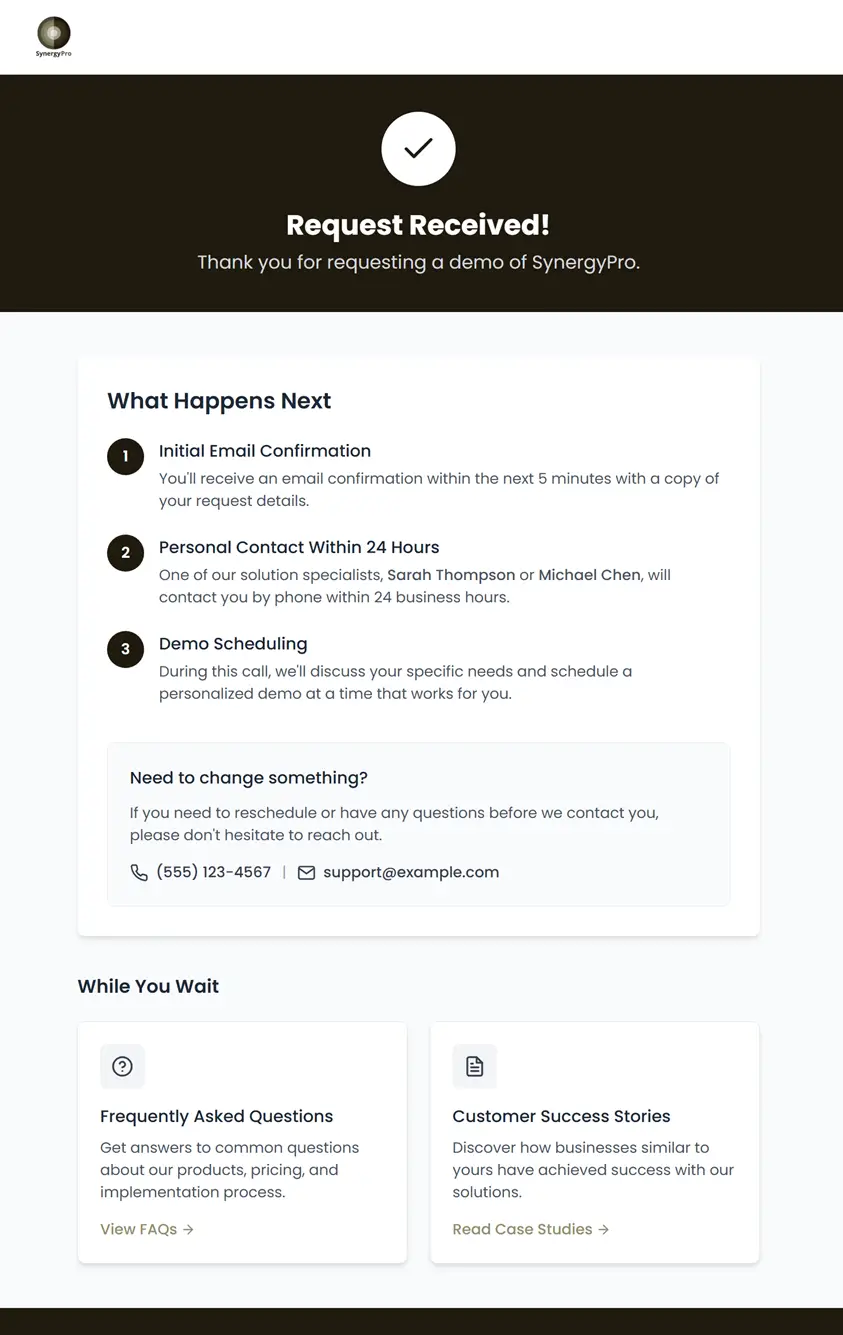
Example of a thank you page for a contact/demo request form.
- Focus: Managing expectations and providing reassurance.
- Elements: Confirmation message, specific timeline for follow-up ("We'll call you within 24 hours," "Expect an email from [Name] on our team"), link to FAQs or case studies relevant to their potential needs.
- Why it works: Reduces anxiety about when/how they'll be contacted, provides valuable info while they wait.
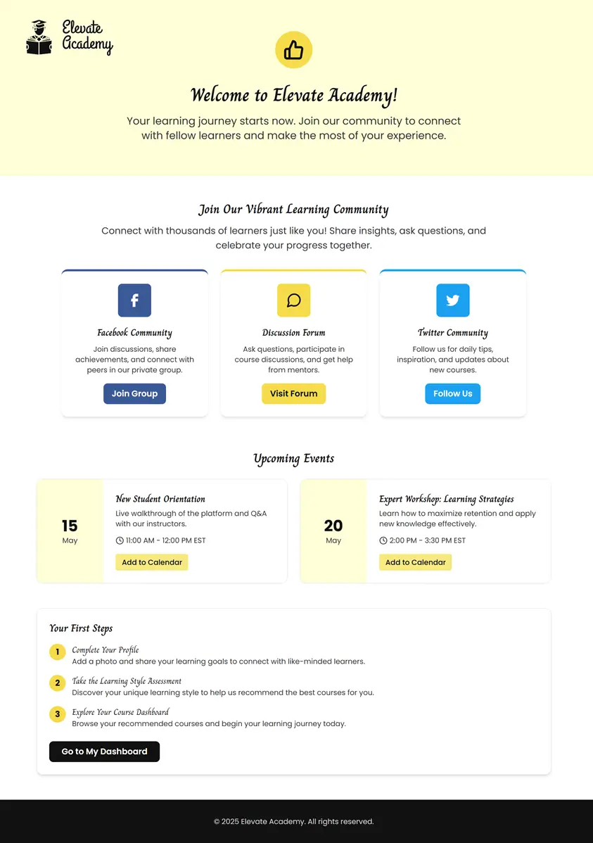
Example of a thank you page for a sign-up/registration form.
- Focus: Onboarding and encouraging community participation.
- Elements: Welcome message, links to "Join our Facebook Group," "Follow us on Twitter," "Visit our Forum," or "Explore upcoming events."
- Why it works: Integrates new users into your ecosystem and fosters loyalty.
The "Upsell/Cross-sell" Page (Sales/Purchase Completions)
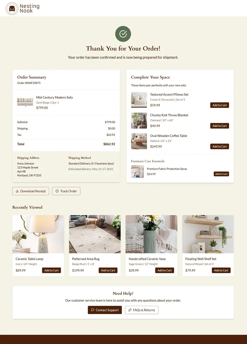
Example of a thank you page for a purchase order form.
- Focus: Suggesting related products or services.
- Elements: Order confirmation summary, thank you message, "You might also like..." section with product recommendations, link to customer support.
- Why it works: Capitalizes on buying momentum to increase average order value.
FluentCRM's collection of 11 conversion-boosting thank-you pages offers diverse examples showcasing different industries and goals, from B2B lead generation to e-commerce purchases, highlighting how varied and effective these pages can be.
Overcoming the Hurdles: Why Most Thank-You Pages Fall Short (and How to Fix It)
So, if the benefits are so clear, why are so many thank-you pages still neglected?
- Limited Form Builder Options: Many popular form builders offer only basic text fields for their thank-you messages, making advanced design and multiple CTAs impossible.
- Lack of Technical Resources: Creating a custom HTML page requires some coding knowledge, and hosting it adds another layer of complexity.
- Design Constraints: Even with more flexible editors, crafting an aesthetically pleasing and on-brand page requires design skills.
- Strategic Blind Spots: Teams simply haven't recognized the potential of this page and haven't allocated resources or thought into its purpose.
While platforms like Make and Zapier offer powerful automation capabilities that can *act* on form submissions (like sending emails, adding rows to spreadsheets, etc.), they often still rely on the form builder's basic thank-you page for the immediate post-submission confirmation, unless you build a custom redirect workflow.
Introducing a Solution: Instantly Generate a Custom, Branded HTML Thank-You Page (for Free)
Recognizing these challenges, we developed a tool to empower anyone to create a beautiful, strategic thank-you page without needing design skills or coding knowledge.
We built a free AI-powered tool that generates a clean, branded thank-you page based on a few quick inputs.
Here's how it simplifies the process:
- Simple Inputs: Just describe your form's purpose (e.g., "quote request form for a marketing agency"), upload your logo, select your brand colors, and optionally add specific text for your message and CTAs.
- AI-Powered Design: Our tool leverages AI to craft a visually appealing, mobile-responsive HTML page that aligns with your brand identity.
- Instant Output: You get a downloadable, lightweight HTML file instantly.
- Flexible Usage:
- Redirect: Point your form's thank-you redirect URL to this HTML page hosted on your own server or a simple hosting service.
- Automation Integration: We provide clear instructions on how to integrate this HTML page with powerful automation tools like Make.
Try Servalian's Thank You Page Generator here!This tool removes the technical and design barriers, allowing you to focus on the strategy and message of your thank-you page.
While our generator simplifies creating the HTML structure, here are other tools and approaches that can be useful:
- Form Builders with Enhanced Options: Many form builders offer limited thank-you page customization, but a few stand out by providing more control and better visual editors for their post-submission screens or redirect pages right within their platform. These can be good options if you want the thank-you experience integrated directly into your form builder workflow.
- Outgrow: Known for interactive content like quizzes, calculators, and assessments, Outgrow also includes powerful form capabilities. Their outcome and thank-you pages are highly visual and customizable, allowing for rich media, custom branding, and dynamic content display based on user input, making them far more engaging than typical form thank-you screens.
- Paperform: Designed with flexibility and aesthetics in mind, Paperform offers a robust thank-you page editor. You can embed videos, images, maps, add multiple calls-to-action, and completely control the layout and branding to create a sophisticated post-submission experience directly within their interface.
- CodePen or JSFiddle: Excellent for quickly prototyping and testing raw HTML, CSS, and JavaScript layouts if you have some coding comfort. You can paste the generated HTML from our tool here to tweak it further.
- HTML Online Editor: Provides a WYSIWYG (What You See Is What You Get) interface alongside the code view, making it easier to visualize and edit the content and basic styling of your HTML file.
- Website Builders (with limitations): Some website builders like Wix, Squarespace, or Webflow allow embedding custom HTML sections or creating dedicated pages you can redirect to. The limitation is often in dynamically changing content based on the form submission without complex workarounds.
- Landing Page Builders: Tools like Leadpages, Unbounce, or Instapage are specifically designed for creating high-converting landing pages, and they usually offer robust thank-you page builders with more design flexibility and integration options than standard form builders. However, these are often paid solutions.
The key is to choose a method that balances your technical comfort, design needs, and desired level of customization. Our free generator aims to provide a powerful baseline solution accessible to everyone.
Final Thoughts: Making Every Interaction Count
Your thank-you page is the digital equivalent of walking someone to the door after a pleasant visit – you don't just close it abruptly.
You offer a polite goodbye, perhaps suggest the next time you might see each other, and leave a lasting positive impression.
By moving beyond the default "Thanks" message and strategically designing your post-form experience, you transform a forgotten corner of your website into a valuable asset.
You build stronger trust, manage expectations effectively, and guide users towards actions that benefit both them and your business.
Whether you use a free generator, leverage automation tools like Make, or custom code your pages, investing a little time in optimizing this final step of the form journey is an investment in better user experience, stronger brand perception, and ultimately, improved conversion rates.
Subscribe to our newsletter to receive the latest news from SaaS, tips, tricks and insights directly to your inbox.